

Boutique en ligne
Réservations
Événements
Éphémère

Compare Table
Par
Your packages side by side, in a real table
Aucun avis pour le moment
Offre non payante disponible

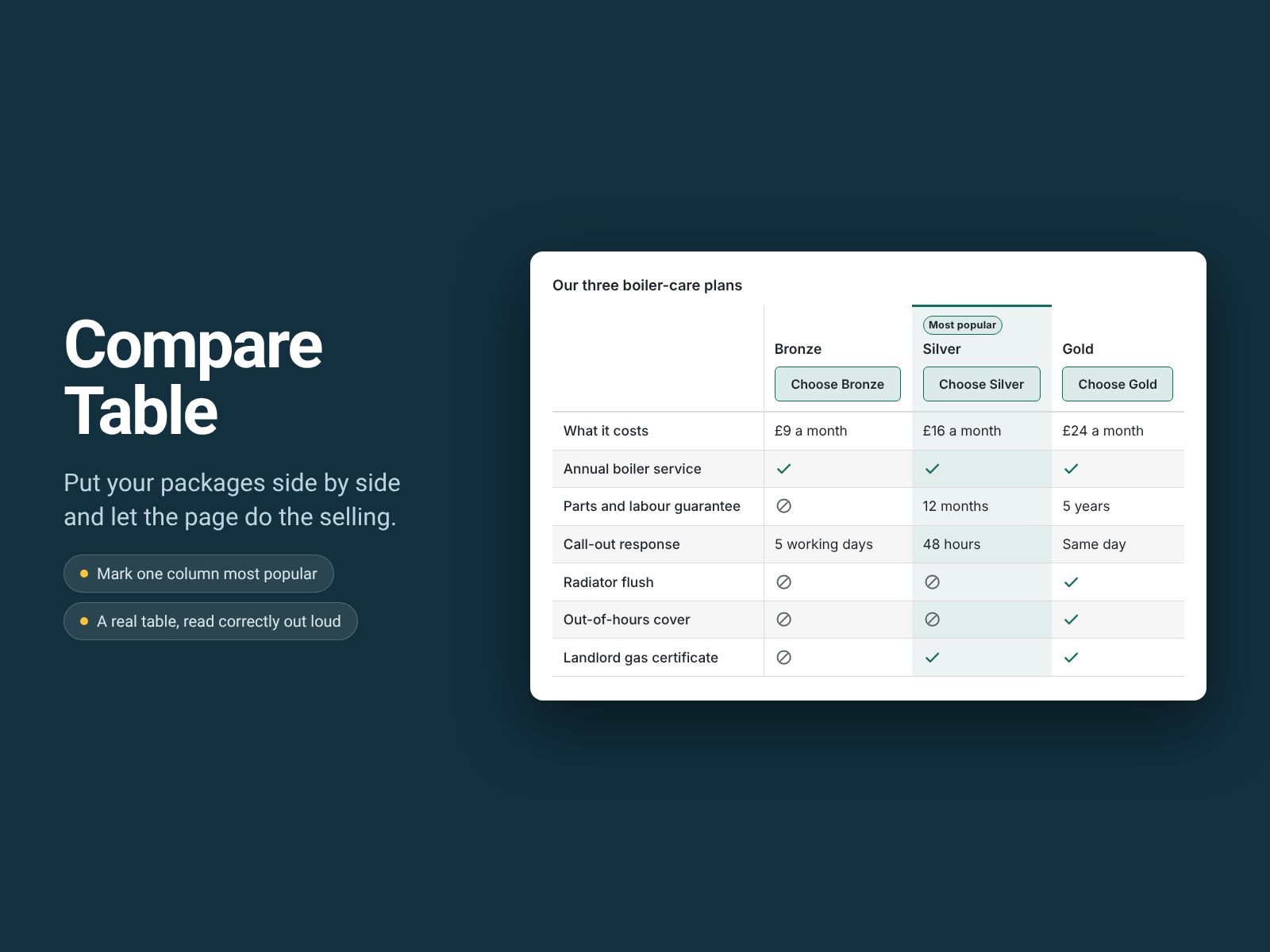
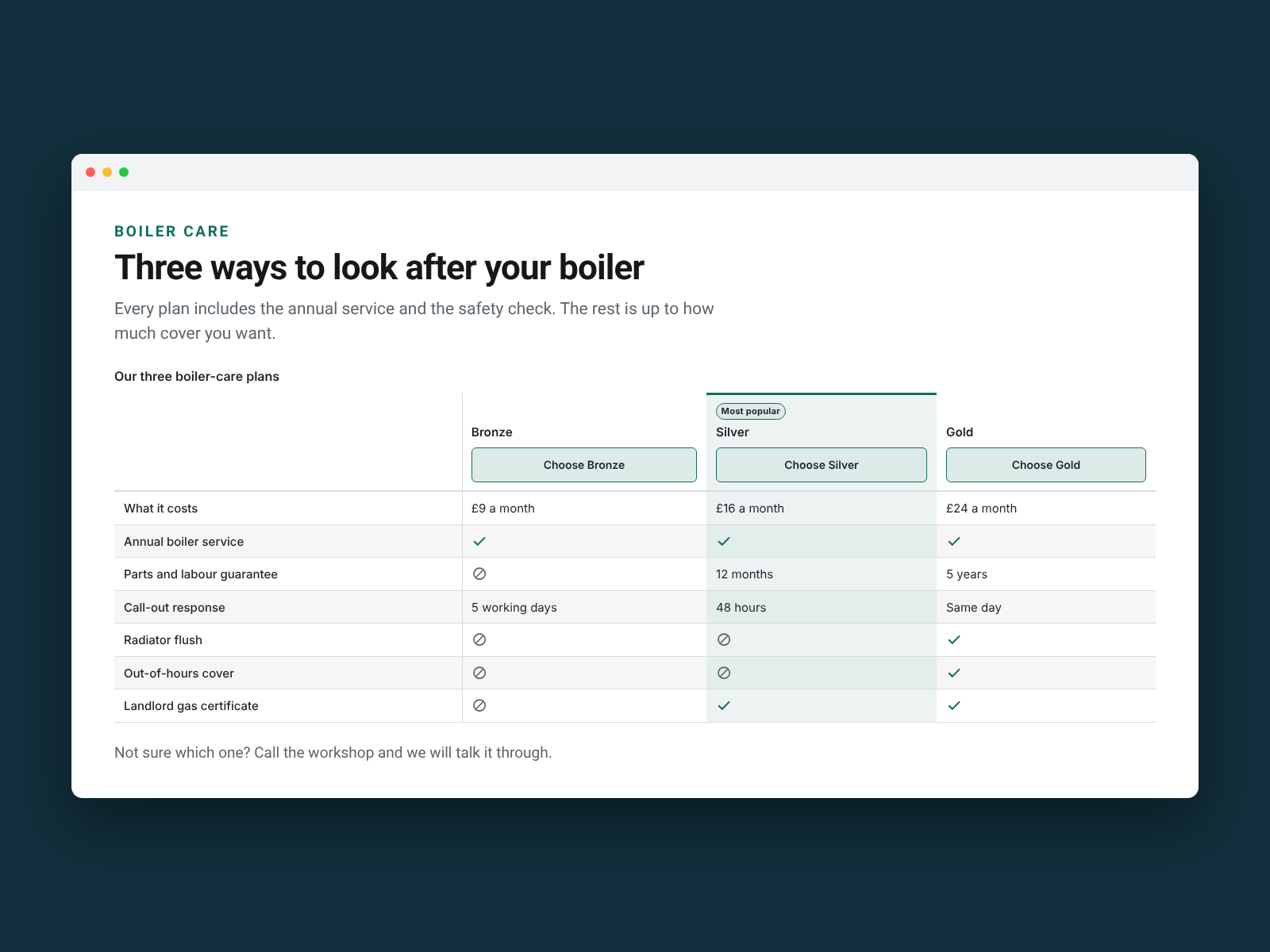
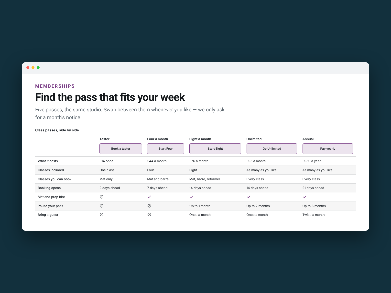
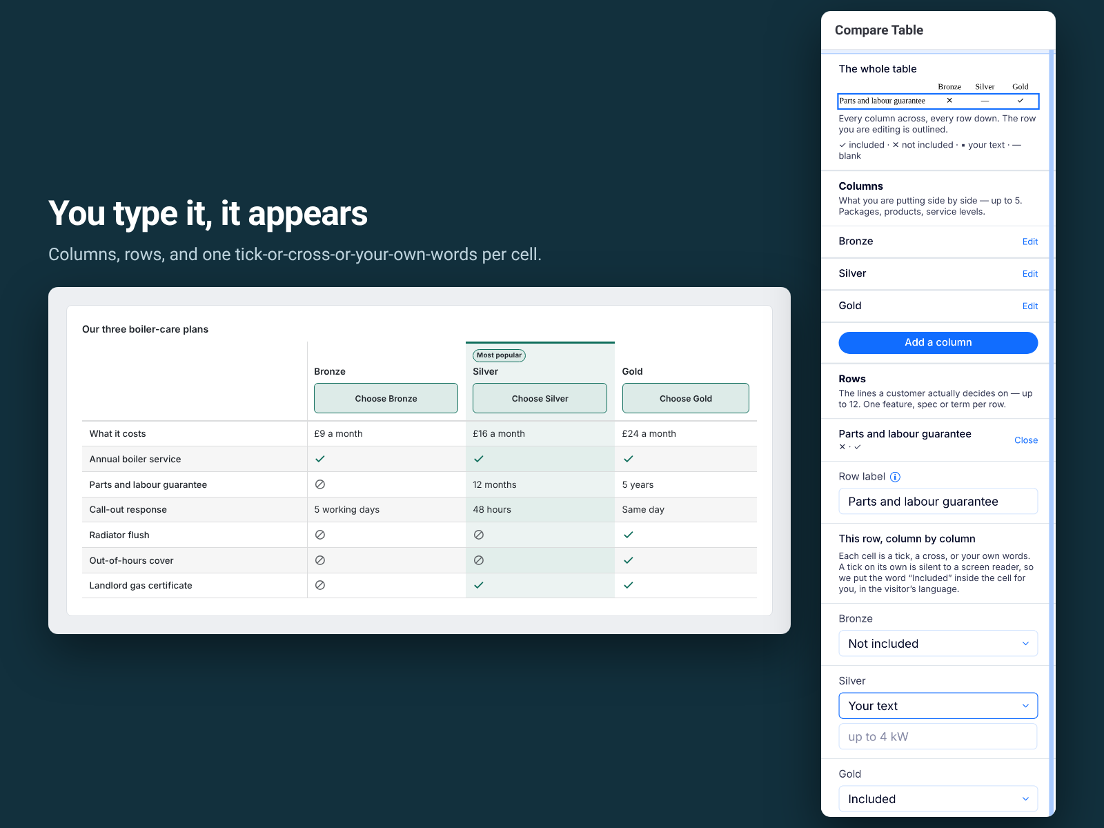
Aperçu de Compare Table
- A real table, not a grid of boxes — proper column headings and row labels
- Every tick carries a word — "Included" or "Not included", read out loud
- Works at 320px — the table scrolls sideways inside its own frame
- A button under each column, and one column badged most popular
Disponibilité :
Cette application est disponible dans le monde entier.Langues de l'application :
Anglais,
Allemand,
Coréen,
Espagnol,
Français,
Italien,
Japonais,
Néerlandais,
Polonais,
Portugais,
Russe,
Turc
Note et avis
Cette appli n’a pas encore reçu d’avis, soyez le premier à l'évaluer.Prix et formules
Formule Basic
Gratuit
Three columns and six rows per page
Every colour, label and highlight
Twelve languages and full screen reader text
Permanent, and it never expires
Formule Pro
$
4
08
/mois
Up to five columns and twelve rows
A button under each column, to the page you choose
Mark one column as most popular
Free plan: 3 columns and 6 rows a table
* Le prix est en USD.